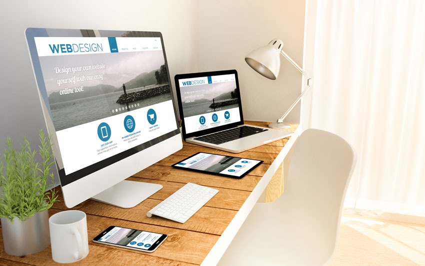
With the help of these six tips you will be able to fully revise your website to make it more appealing to your customers. Use the advantages of the internet to win new customers for your business.
When designing a website you should pay attention to the following rules:
1. Convey the correct company image from the start
In our daily lives we often get a feeling regarding who a person is, what she does, what she likes, etc. upon first meeting them. Visiting a website for the first time is no exception. Simply looking at your homepage inspires everyone to subconsciously judge it immediately. A crowded page full of texts, colours, sizes and fonts convey a different image than a rather empty one with a more structured assortment of texts and pictures.
2. Easy navigation
Website users do not want to invest time in their search for information. The site’s structure should be easily detectable and navigation should, as the name suggests, help the visitor make its way across your page.
3. Don’t beat around the bush
Every page should clearly state what it is about. What are the most important pieces of information? What are special offers? Short texts and few but expressive photos or graphics help your customers find what he is looking for as conveniently as possible.
4. Invest in professional photos
Pictures say more than a thousand words. Invest in professional photos. Website-visitors can often https://www.advantidesign.de/wp-admin/users.phptell whether the photos were taken yourself, bought on an internet database or taken exclusively for your company by a photographer. If professionals are not in your budget, you can find a large selection of stock-photos on multiple online databases but keep one thing in mind: pictures taken for your use only can mirror your company’s exact image and make your website more personal. Our general tip: no photos are better than bad photos.
5. Create a color-concept
The colours you use for your website should be the same colours you have used on other kinds of advertisements. Your visitors will be confused if those are green / orange and your website is blue / red and become uncertain whether he has ended up at the destination he was looking for.
Do not overwhelm your page with colors just because you can. Less is always more in this case. Use colours to highlight important sections.
6. Use a Responsive Design
Whether you’re at the office, your computer, on your tablet on the couch or on the go with your phone, users want to be able to use any device to receive the information you are providing. It is therefore very important that your website’s design can adjust any monitor sizes.


Comments are closed.